データをグラフで視覚化する
デカルト座標平面を理解する
リストとタプルの操作
[10]:
import unittest


class TestListTuple(unittest.TestCase):
    def test_01(self):
        simplelist = [1,2,3]
        self.assertEqual(simplelist[0],1)
        self.assertEqual(simplelist[1],2)
        self.assertEqual(simplelist[2],3)

    def test_02(self):
        stringList = ['a string', 'b string', 'c string']
        self.assertEqual(stringList[0], 'a string')
        self.assertEqual(stringList[1], 'b string')


if __name__ == '__main__':
    unittest.main(argv=['first-arg-is-ignored'], exit=False)
..
----------------------------------------------------------------------
Ran 2 tests in 0.001s

OK
リストやタプルで繰り返す
[1]:
import unittest

class TestForin(unittest.TestCase):

    def test_01(self):
        l = [1, 2, 3]
        for item in l:
            print(item)
            self.assertIn(item, [1, 2, 3])


if __name__ == '__main__':
    unittest.main(argv=['first-arg-is-ignored'], exit=False)
.
1
2
3
----------------------------------------------------------------------
Ran 1 test in 0.001s

OK
matplotlibでグラフを作る
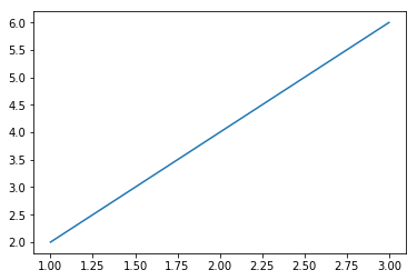
[7]:
import matplotlib.pyplot as plt

x_numbers = [1, 2, 3]
y_numbers = [2, 4, 6]
plt.plot(x_numbers, y_numbers)
plt.show()

グラフで点を作る
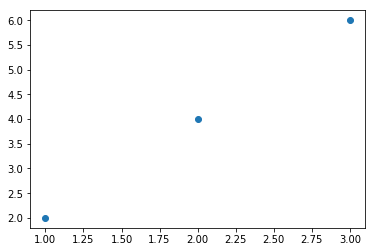
[8]:
import matplotlib.pyplot as plt

x_numbers = [1, 2, 3]
y_numbers = [2, 4, 6]
plt.plot(x_numbers, y_numbers, 'o')
plt.show()
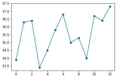
ニューヨーク市の年間平均気温をグラフ化する
[10]:
import matplotlib.pyplot as plt

nyc_temp = [53.9, 56.3, 56.4, 53.4, 54.5, 55.8, 56.8, 55.0, 55.3, 54.0, 56.7, 56.4, 57.3]
plt.plot(nyc_temp, marker='o')
plt.show()
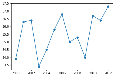
[12]:
import matplotlib.pyplot as plt

nyc_temp = [53.9, 56.3, 56.4, 53.4, 54.5, 55.8, 56.8, 55.0, 55.3, 54.0, 56.7, 56.4, 57.3]
years = range(2000, 2013)
plt.plot(years,nyc_temp, marker='o')
plt.show()
ニューヨーク市の月間気温傾向を比較する
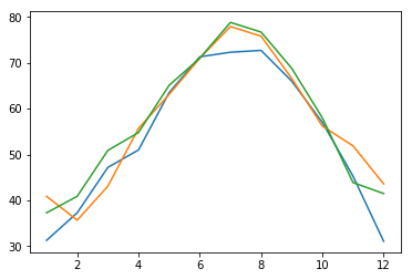
[13]:
import matplotlib.pyplot as plt

nyc_temp_2000 = [31.3, 37.3, 47.2, 51.0, 63.5, 71.3, 72.3, 72.7, 66.0, 57.0, 45.3, 31.1]
nyc_temp_2006 = [40.9, 35.7, 43.1, 55.7, 63.1, 71.0, 77.9, 75.8, 66.6, 56.2, 51.9, 43.6]
nyc_temp_2012 = [37.3, 40.9, 50.9, 54.8, 65.1, 71.0, 78.8, 76.7, 68.8, 58.0, 43.9, 41.5]
months = range(1, 13)
plt.plot(months, nyc_temp_2000, months, nyc_temp_2006, months, nyc_temp_2012)
plt.show()
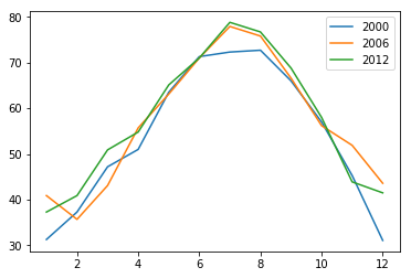
[16]:
import matplotlib.pyplot as plt

nyc_temp_2000 = [31.3, 37.3, 47.2, 51.0, 63.5, 71.3, 72.3, 72.7, 66.0, 57.0, 45.3, 31.1]
nyc_temp_2006 = [40.9, 35.7, 43.1, 55.7, 63.1, 71.0, 77.9, 75.8, 66.6, 56.2, 51.9, 43.6]
nyc_temp_2012 = [37.3, 40.9, 50.9, 54.8, 65.1, 71.0, 78.8, 76.7, 68.8, 58.0, 43.9, 41.5]
months = range(1, 13)
plt.plot(months, nyc_temp_2000, months, nyc_temp_2006, months, nyc_temp_2012)
plt.legend([2000, 2006, 2012])
plt.show()
グラフのカスタマイズ
題名と説明ラベルを追加する
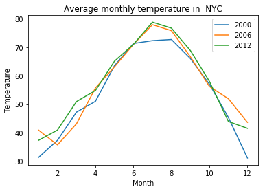
[17]:
import matplotlib.pyplot as plt

nyc_temp_2000 = [31.3, 37.3, 47.2, 51.0, 63.5, 71.3, 72.3, 72.7, 66.0, 57.0, 45.3, 31.1]
nyc_temp_2006 = [40.9, 35.7, 43.1, 55.7, 63.1, 71.0, 77.9, 75.8, 66.6, 56.2, 51.9, 43.6]
nyc_temp_2012 = [37.3, 40.9, 50.9, 54.8, 65.1, 71.0, 78.8, 76.7, 68.8, 58.0, 43.9, 41.5]
months = range(1, 13)
plt.plot(months, nyc_temp_2000, months, nyc_temp_2006, months, nyc_temp_2012)
plt.title('Average monthly temperature in  NYC')
plt.xlabel('Month')
plt.ylabel('Temperature')
plt.legend([2000, 2006, 2012])
plt.show()
軸のカスタマイズ
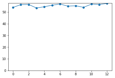
[18]:
import matplotlib.pyplot as plt

nyc_temp = [53.9, 56.3, 56.4, 53.4, 54.5, 55.8, 56.8, 55.0, 55.3, 54.0, 56.7, 56.4, 57.3]
plt.plot(nyc_temp, marker='o')
plt.axis(ymin=0)
plt.show()
pyplotを使ってプロットする
[21]:
import matplotlib.pyplot as plt


"""
pyplotを使った簡単なプロット
"""
def create_graph():
    x_numbers = [1, 2, 3]
    y_numbers = [2, 4, 6]
    plt.plot(x_numbers, y_numbers)
    plt.show()


create_graph()

プロットの保存
[22]:
import matplotlib.pyplot as plt

x = [1, 2, 3]
y = [2, 4, 6]
plt.plot(x,y)
plt.savefig('mygraph.png')
式をプロットする
ニュートンの万有引力の法則
\(F = {Gm_1m_2 \over r^2}\)
[ ]:
'''
2物体間の万有引力と距離の関係
'''
import matplotlib.pyplot as plt


# グラフを描く
def draw_graph(x, y):
    plt.plot(x, y, marker='o')
    plt.xlabel('Distance in meters')
    plt.ylabel('Gravitational force in newtons')
    plt.title('Gravitational force and distace')
    plt.show()


def generate_f_r():
    # generate value for r
    r = range(100, 1001, 50)
    # Fの計算値を格納数する空リスト
    F = []
    # 定数G
    G = 6.674*(10**-11)
    # two masses
    m1 = 0.5
    m2 = 1.5
    # 引力を計算しリストFに加える
    for dist in r:
        force = G*(m1*m2)/(dist**2)
        F.append(force)
    # draw_graph関数呼び出し
    draw_graph(r, F)


generate_f_r()
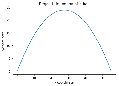
投射運動
\(u_y=u\sin\theta-gt\)
\(S_y=u(\sin\theta)t - {1 \over2}gt^2\)
\(t={u \sin\theta \over g}\)
\(t_{fly} = 2t_{fly} = 2{u\sin\theta \over g}\)
[31]:
from matplotlib import pyplot as plt


import math


'''
2つの値の間の等間隔な浮動小数点数の生成
'''
def frange(start, final, increment):
    numbers = []
    while start < final:
        numbers.append(start)
        start = start + increment

    return numbers


'''
投射運動物体の軌跡を描く
'''
def draw_trajectory_graph(x, y):
    plt.plot(x, y)
    plt.xlabel('x-coordinate')
    plt.ylabel('y-coordinate')
    plt.title('Projecttitle motion of a ball')


def draw_trajectory(u, theta):
    theta = math.radians(theta)
    g = 9.8
    # Time of flight
    t_flight = 2*u*math.sin(theta)/g
    # find time intervals
    intervals = frange(0, t_flight, 0.001)
    # list of x and y coordinates
    x = []
    y = []
    for t in intervals:
        x.append(u*math.cos(theta)*t)
        y.append(u*math.sin(theta)*t - 0.5*g*t*t)
    draw_trajectory_graph(x, y)


initial_velocity = 25
angle_of_projection = 60
draw_trajectory(initial_velocity, angle_of_projection)
plt.show()